Photographic Techniques
When taking my photos for my magazine, I have to consider these techniques in order for my images to come out the best way possible.
These are a list of ideas and techniques that are essential when taking a good photograph:
·
Shot
distance
·
Use of
tilt
·
Shot
composition
·
Eye Line
·
Tone
·
Line
·
Colour
including vivid, primary and monochromatic colour
·
Texture,
and hints on creating texture
·
Patterns
and hints on capturing patterns
Shot distance Types:
(example of an ELS)
Medium long shot/Medium shot- Good for showing movement or for a balanced tracking of characters
and their environment.
Medium close up/close up- Good for portraiture or for moving image interviews.
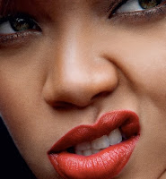
 Big close up/Extreme close up- Good for showing the significance of character or for showing the
characters as powerful. Also highly useful drawing attention to character
emotions.
<---(example of an BCU/ECU)
Tilt Shots:
Tilt up shot (low angle)- Used to convey power of dominance.
Tilt down shot (high angle)- Used to show vulnerability or
weakness of person in shot and to demonstrate dominance of point of view.
Tone:
Control of tones, including variations of light and dark,
emphasizing important parts of the image, and colour, generally set the mood of
your photograph.
Tone Control can be used to emphasise the shapes of the most
important elements in your image.
Composition:
Many photographers place their subject in the middle of the
photograph, which can often result in a dull image. I am going to take this on board when taking my photos so I can come out with the best images to use in my magazine. Use of off centre composition can create a focal point so this is something to consider for my photos.
Foreground/Background:
When designing a shot it is key to remember to keep in mind both the action in
the foreground and the background. I would like my background to be white with the foreground focusing on my model.
Framing:
When I am designing my shot, it is important to keep the rule of thirds in mind so that the viewers eye is drawn to the cross sections of a frame.
Lines are useful for emphasizing and leading the viewer towards a
main area or subject.
They may also divide up the picture space into segments, which vary
in size and shape. The shape of lines and their general pattern can strongly
influence the mood of the photograph.
The appearance of lines can be controlled in your pictures by
camera viewpoint.
Using colour:
Taking control of the way in which colour is used in your photos is
a key was of improving your images. Colour sells so I plan on using a lot of bright and bold shades on my magazine cover to help catch the audiences attention. I will also use colours with muted tones so that the magazine doesn't look over the top and will prevent people from buying it.
Textures:


Can you have a look at the formatting at the top of the post it reads a little dodgy on my computer
ReplyDeleteI have updated the formatting of this post, it looks clear and not so jumbled up anymore.
ReplyDelete